LifeSignz: Look up in the sky…
As designers, we obsess over things that most people don’t know exist, attempting to make the inherently boring deceptively interesting. Like most of my peers, I spend much of my time with typography. Weighing the advantages and disadvantages of one font over another, evaluating letter forms, the spaces between lines, between words, between letters, and around the letters, and getting “lost in the weeds” before reaching for the Tylenol. All this is done to create an appropriate typographic “mood” that supports the message of whatever I am working on.
One day, while struggling with a project that wasn’t coming together, I decided it was time to get out of the office and clear my head. With no destination in mind, I jokingly asked God for a sign while walking through the lobby and exited onto the crowded sidewalk. Being a native New Yorker, the stimulation of being in a crowd helps me think. I followed along and found myself strolling down 42nd Street toward Times Square.
The Most Visible “Signs” of Typography were Above My Head
As if to answer my prayer, it suddenly dawned on me that the most visible examples of typography are right under my nose—or, most times, above my head. My college courses in typography focused on dry works in print by Scandinavian or German designers, where they discussed kerning, X-heights, non-serif fonts as opposed to serif fonts, serif fonts with short serifs vs. those with short serifs, and just for fun, the occasional umlaut.
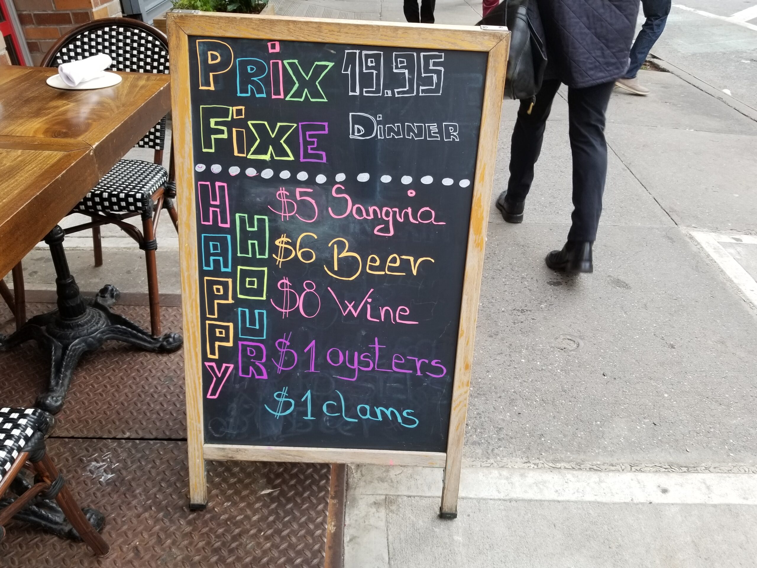
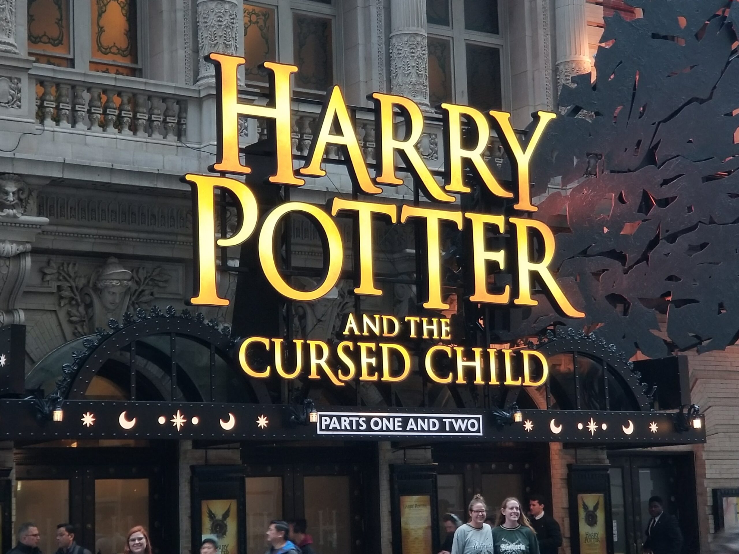
But here, out in the typographic wilderness, there were countless signs in all sizes, shapes, media, levels of taste, and legibility. From gaudy marquees that lit up the night to hand-scrawled menus on sidewalk chalkboards created, some created by designers, but also some by business owners, carpenters, electricians, salespeople, overworked interns, and waitpeople. My newly opened designer eyes saw signs everywhere: handwritten signs, colorful signs, huge signs, good signs, bad signs, signs hanging off the sides of buildings, signs in windows, signs in distress, neon signs, signs on buses, signs in stores that sold signs—in many cases, kerning appears to be optional!
My Typographic Journey
They had many purposes: identifying locations, branding businesses, and providing information or directions. They were more than just the musing of some (possibly depressed) Norwegian designer from the 1930s. They had something vital to say and fractions of a second to grab your attention and give you their message.
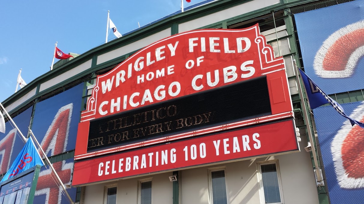
I started photographing these signs, and soon, my smartphone and Google Photo account were overflowing with photos of signage that caught my attention for any reason. This site is not meant to be “The Best Of Street Signs.” It is a sample of photos I took on my journey to record interesting signs wherever I found them, from city streets to rural areas, from ballparks to restaurants, at night, and during the day. Once I got started, it became a borderline obsession.
Regardless of how they got there, they are designed to be noticed, declaring each business’s uniqueness. They are living testaments to commerce and to someone’s ambitions, dreams, and concerns.
There are typography in real life. — Michael Pilla

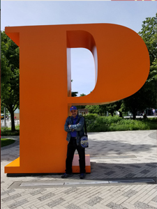
Michael Pilla—In Chicago with his favorite letter


